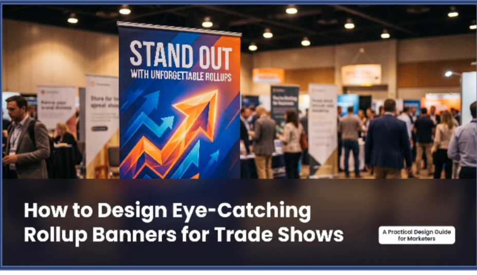
How to Design Eye-Catching Rollup Banners for Trade Shows
Meta Title: How to Design Eye-Catching Rollup Banners for Trade Shows
Meta Description: Practical guide to designing rollup banners for trade shows — visual hierarchy, headline writing, colour, typography, and mistakes to avoid before production.
Trade shows are noisy environments. There are hundreds of exhibitors fighting for the same attention from the same exhibition floor – and most of them are sporting rollup banners. The question isn’t if you should use a rollup banner for your next trade show, it’s when. It’s whether it’s the one that the visitors stop to read or not.
It’s all about a few design choices between a roll-up banner that stands out and one that fades in the background. These get correct, and one of the best and most affordable display items available is your roll up banner. If they get it wrong, it will cost you the price of wallpaper.
This guide explains the principles of design for rollup banners based on the actual flow of visitors through and interaction with exhibition settings
Understand How Trade Show Visitors See Your Banner
The first step in creating any of your rollup banners is figuring out how visitors will interact with your banner at the trade show.
The majority of visitors will view your banner from 4-6 metres away and will be moving before they make a decision about approaching your stand. They will be able to read about 5-7 words clearly at this distance and speed. They record one dominating visual element. They make a first impression in less than 3 seconds.
All other design restrictions are derived from this one. Your banner does not make a brochure. It is not a web site. It’s a 3-second impression tool that’s meant to serve one purpose — get the right visitor to stop and interact.
All design decisions made must be based on this one question — will this help or harm the 3-second impression?
So, what are the five Design Principles that make Rollup Banners work at Trade Shows?
There’s one message, not many.
The biggest rollup banner error is to attempt to say it all at trade shows. Company history. Product range. Contact details. Awards. Certifications. Testimonials. All on one 850mm x 2000mm panel.
This creates a banner that conveys no message, as the visitor’s eye is not directed to the message and it is not placed in front of them before they have moved on.
1. The main message that a rollup banner conveys at a trade show is:
- Who you are
- How your product or service solves a problem
- Or why a visitor should STOP
Pick one. State it boldly. Make all other things negligible or non-existent.
Product information, the contact and website URL are in a brochure or a discussion. The role of the banner is to begin the discussion, not to take its place.
2. Headline First — Everything Else Second
- The headline is the most important part of your banner. This is what visitors read from 5 metres away. The reason is why they choose to walk on or off.
- A great trade show rollup banner headline is one that does one of three things:
- States a clear benefit: “On time floor to ceiling exhibition stands.
- Questions relevant: “Still having the same exhibition stand from 2019?
- Stakes a strong, clear claim: The UAE’s most-installed outdoor signage system.
- A mediocre headlines attach a general description to the company: “Premium solutions for your business needs.” It could be any company at any trade show of any kind. It stops nobody.
- Write the headline before the news. Test it by visualising someone reading it as they walk by at a normal pace, at 5 metres. If it doesn’t fit into that scenario — rewrite the message.
3. Visual Hierarchy – Lead the eye.
Visual hierarchy is a careful arrangement of design elements where the eye is drawn through the banner in the order of importance, from the most important to the least.
The order of a trade show rollup banner should be:
1 — Most prominent feature (logo or hero image).
3 — Good luck! — (the two messages)
4 — Supporting line (two sentences of context or proof)
5 — Media kit (promotional materials)
All other elements should be eliminated or visually subordinate to the four elements.
The most effective ways to establish visual hierarchy on a rollup banner are through scale and contrast: The biggest, highest-contrast element will be read first! A 72pt bold white headline will always be read first, on a dark background, before the body copy, which is 12pt grey on white.
4. Colour – Use it deliberately:
There are two things that colour does on a trade show roll up banner. It conveys identity of the brand. And it determines visibility from a distance.
High contrast works. The background color is dark and the text is light. Write on a white background using dark writing. It doesn’t really matter what colours are in the picture, it’s the contrast between them. Low contrast colour schemes (e.g. grey text on a white background, dark blue text on a black background) are not visible from a distance, nor in mixed-light environments such as exhibition spaces.
Limit your palette. Limited to 2 or 3 colours. Three or greater results in visual noise, that diminishes clarity at distance.
Consider the environment. The light in exhibition halls is normally warm overhead light, there is a spotlight on each display and there is a lot of visual competition from other displays. Colors that are considered high quality on a screen can become unappealing or even become invisible in the art world. See a colour proof in the environment of lighting before final production.
The Book is a user-friendly typography.The Book is readable beats beautiful.
Brand guidelines and printed brochures have an elegant appearance in decorative fonts, script typefaces, and thin font weights. They are not legible from far away at a trade show when mounted on a roll up banner.
There are three rules that should be adhered to when creating typography for trade show rollups:
Lightweight for the body text. Light and regular font weights are too light to be seen at 5 metres.
Sans-serif for everything. Serif fonts are not as legible at small size and at distance. Sans-serif fonts such as Helvetica, Montserrat, Poppins, Futura are legible at a distance.
Minimum 60pt for any text that needs to be read from a distance. If the copy is less than 40pt, the chances of anyone reading it, without stopping at the stand, is low. There is a limit to how large the text needs to be to read from 3 metres, and if so, it should not be placed on the banner.
The Three-Zone Layout
The three-zone structure of a trade show rollup banner is the most dependable design for a rollup banner.
Top 40% of the banner is the top zone. Top 40% of the banner is called the top zone.
Brand identity and headline. It is visible even if a crowd of people is standing in front of the banner — as it is above the head height. The headline and logo need to be in this position.
Middle zone (middle 40% of the banner):
Backing up message, key benefits or hero image. The primary reading area of visitors who have stopped at this stand. Maintain tidiness and order.
The bottom zone of the banner is the bottom 20% of the banner.
Call to action — Website URL, QR code, social media handle or stand number. Often furniture, bags or people block the view of this zone. Make it of use when it can be seen and of no service when it cannot be.
There are a number of mistakes that are frequently made when putting together a common trade show rollup banner.
A company website is going to be the design brief. The design brief will be a company website.
A website has navigation and multiple pages that are unlimited. A rollup banner is a single banner with 3 seconds. The information hierarchy is completely different.
Considering the printer resolution of the screen:
Rollup banner graphics should be provided 150 DPI at the final size. Sharp graphics on a laptop at 72 DPI will NOT appear sharp and professional in a printed banner at banner size.
Failing to take the viewing context into account:
What looks great on a bright computer screen in the middle of a design session doesn’t necessarily look great in the lighting in an exhibition hall. Never approve final production without checking a physical proof or good quality mockup.
Putting the call of action in an area that will be concealed:
Almost any table, counter or furniture in front of a stand will obscure a rollup banner QR code or website URL in the bottom 150mm of the banner. Don’t put calls to action at the bottom third, place them in the lower third.
Improperly used too many fonts:
- Use 2 fonts at most. Headline and body. More than two things create visual inconsistencies that threaten the credibility of your brand.
- Create layouts for multiple configurations of banners.Design layouts for multiple banners.
- A lot of exhibitors employ two or even 3 roll up banners together to make a display wall. You can do this by using the banners as a system (not as single units).
Three banners that can be displayed as a single display wall are generally a much stronger statement than three separate banners side by side. Consider:
- A headline or visual element which extends itself across all three panels.
- Good background treatment throughout the entire width
- Content for individual panels, which is meaningful when designed as part of the larger display and for its own sake.
Before You Go to Print
To get your rollup banner design approved for the production of your rollup, go through this checklist:
- Does the headline encompass the one thing you want to say in 5 words or less?
- Can be seen from 5 metres away?
- Does the font have sufficient weight to be read at a distance?
- Are there enough contrasts between the text and background?
- Is there a call to action that will be visible even with furniture in front of the banner?
- Is the artwork supplied 150 DPI and at final print size?
- Is the design been tested in a lighting environment that is similar to the exhibition hall?
If any of these questions cannot be answered with a definite ‘yes’ — the design must go back through another pass before it can be approved for production.
This Goal is Conversation, Not Decoration.
A roll-up banner is not something that’s used as decoration. It helps to start a conversation. It should deliver one clear message to the right person, at the right time and get their attention, making them stop and engage and begin a conversation with our team at the stand.
All decisions in design should help to achieve that. There’s no such thing as simple, clear and impactful in terms of aesthetic. It’s just a necessary feature of any rollup banner that has to function in the competitive cacophony of a trade show.
Create for the 3 second look. The remainder of the session is conducted face-to-face.